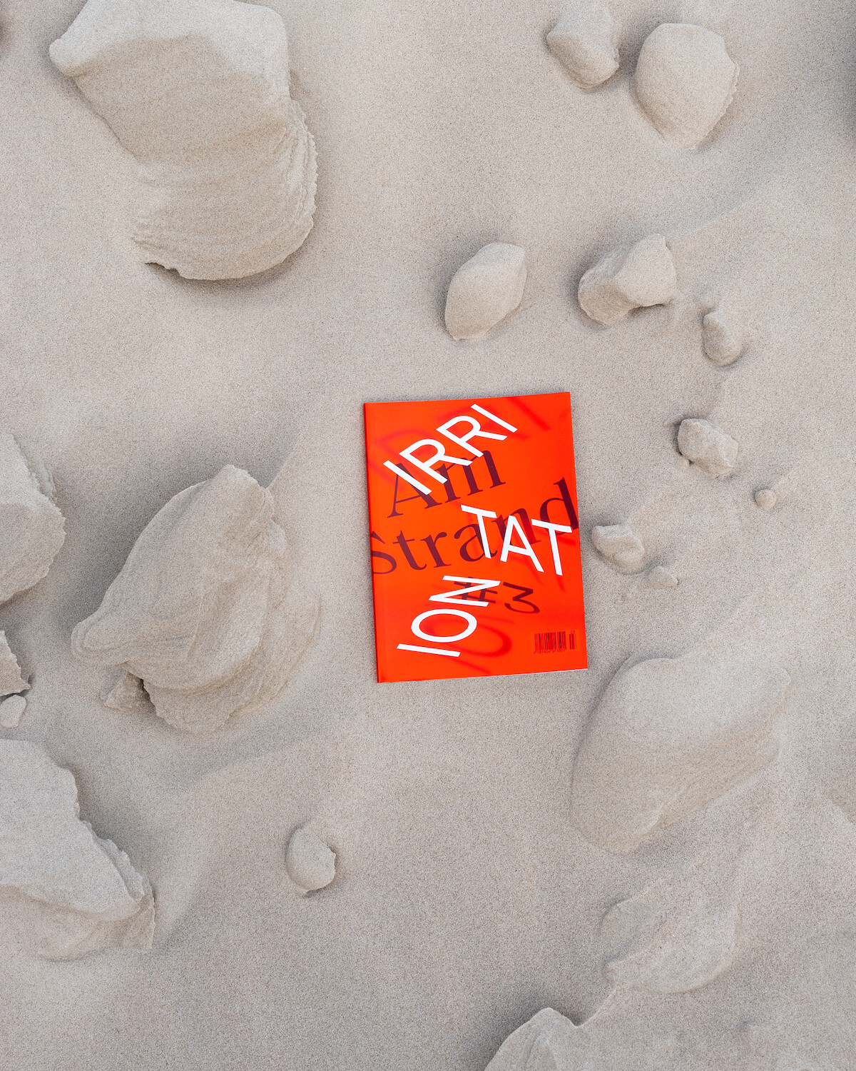
In “Am Strand #3”, photography and graphic design merge. Each contribution was not only individually designed by us, but in some ways re-enacted, so that the way in which we dealt with the contributions became an artistic concept itself. We responded to the artwork submitted by the artists → text and images not only run side by side, but merge in a way. The typography becomes part of the photography. Pictures dissolve away from the surface and seem to become three-dimensional. The footnotes as the “smallest” elements become an image and stand on equal footing with the text referring to them.
Service
Art direction
Magazine design
Photography
Team
Paula Hohengarten
Moritz Zeller
Client
Am Strand Magazin
External Partner
Pögedruck
