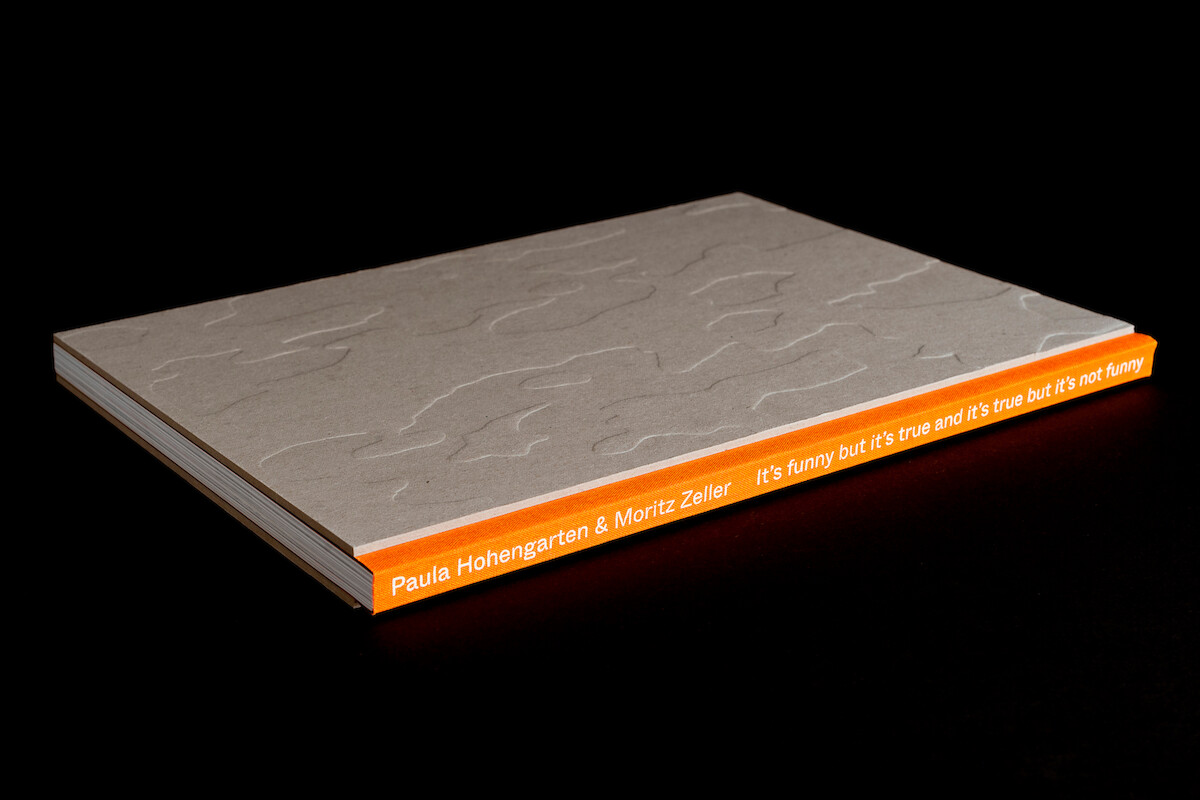
Artist book of the diploma work of Moritz Zeller and Paula Hohengarten. The book consists out of 144 pages, on which we show 48 images of 4 different figures. The image sequence is interrupted by quotes out of John Bergers essay “ways of seeing”. The way, how we decided on the typography of John Bergers text is an interpretation or rather a reaction on its content. We did the whole typography manually: We printed the text and after cutting all the elements we manually connected them again. We scanned the hand made text sheets and within this process the typeface was rasterized again and becomes formally an image. On closer inspection you can see the structure inside of the letters, the varying line pitch, the askew elements, which give the text its own energy. The cover of the artist book was stamped in blind with a handmade woodcut, which refers to the structure of the wood sculptures. The orange fabric tape on the spine markes the joint of the book and refers to the “bending moment of the body”.
Service
Book Design
Team
Paula Hohengarten
Moritz Zeller
External Partner
Thomasdruck