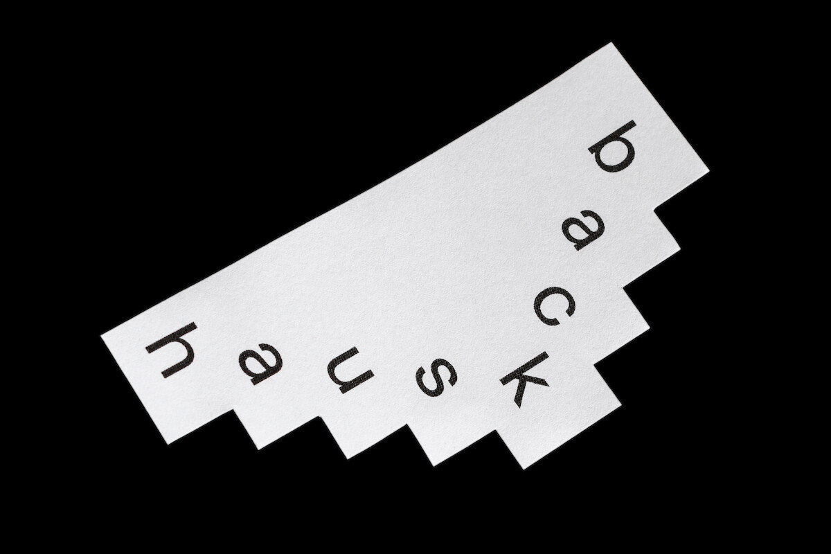
The visual identity of b a c k h a u s (bakehouse) has made the bakery its motto. We created a flexible logo that is always in motion and includes the space surrounding the letters, the architecture. It can take different forms and is always built on the same foundation: b a c k h a u s. The motifs are inspired by what is done in a bakery, by baking. In the first series we look at forms of grain, specifically rye, wheat & barley. We drew the motifs and then photographed them. This creates a special aesthetic. We have chosen the colors so that they match the different seasons → (green/pink) for spring; (beige/white) for summer and (red/blue) for fall.
Service
Art direction
Visual Identity
Photography
Team
Paula Hohengarten
Moritz Zeller
Client
backhaus Skateboards